


6 Essential Elements of a Brand Style Guide

When it comes to growing your business, think of marketing, branding and advertising as three sides of a triangle. Each side is essential, but they work together to serve a larger purpose. In their simplest form:
- Your brand is the personality of your business.
- Marketing is how you communicate your brand.
- Advertising is paid marketing.
Branding allows you to be purposeful when marketing and advertising. This will also allow you to create brand trust and loyalty. On the flip side, marketing and advertising reinforce your brand and help bring it to life.
Defining Your Brand
A cohesive set of brand guidelines helps to create both a visual identity and a professional presence for your brand. Additionally, it outlines the guiding principles for your overall marketing and advertising strategy. Having a defined brand creates an experience for consumers that helps promote brand loyalty through consistency.
Essential Elements of a Brand Style Guide
Depending on your business type and needs, you may consider some different elements for your own brand style guide, but here’s what we recommend including as a basic starting point for creating your brand style guide:
1. Logo
Your brand style guide should include all variations of your logo, including your primary logo, secondary logo and submarks.Your primary logo is the leading of your brand and the image you’ll use the most, whereas your secondary logo is a simplified version. Your secondary logo is typically a condensed version of your primary logo that is used in smaller amounts of space. You’ll likely also have alternate logo versions, like for when your logo needs to appear against a dark background versus white. Submarks are a small icon that uses the least amount of detail/text to communicate your brand. This is used for extremely small spaces or to give repetition of your brand on your website or collateral. Your brand style guide may also include a brand pattern, which uses pieces of your logos to play a background supporting role. The patterns are best used on social media graphics, your website and your packaging.
2. Logo Usage
In addition to your logos, a brand style guide should also include explicit guidelines for how these elements should (and should not) be used. Be sure to define a safe area by establishing the minimum amount of surrounding space needed to prevent from placing other elements near the logo that may distort the perception of the sign. To ensure people can see your logo clearly across all communications, establish a minimum size for print and digital formats. For consistency, you should also determine preferred logo positioning like whether your logo should always appear in the upper right corner.Lastly, make sure you state rules for things to avoid such as not to skew or scale the width or height of your logo, not to alter the color, and not to rotate the logo to any degree.
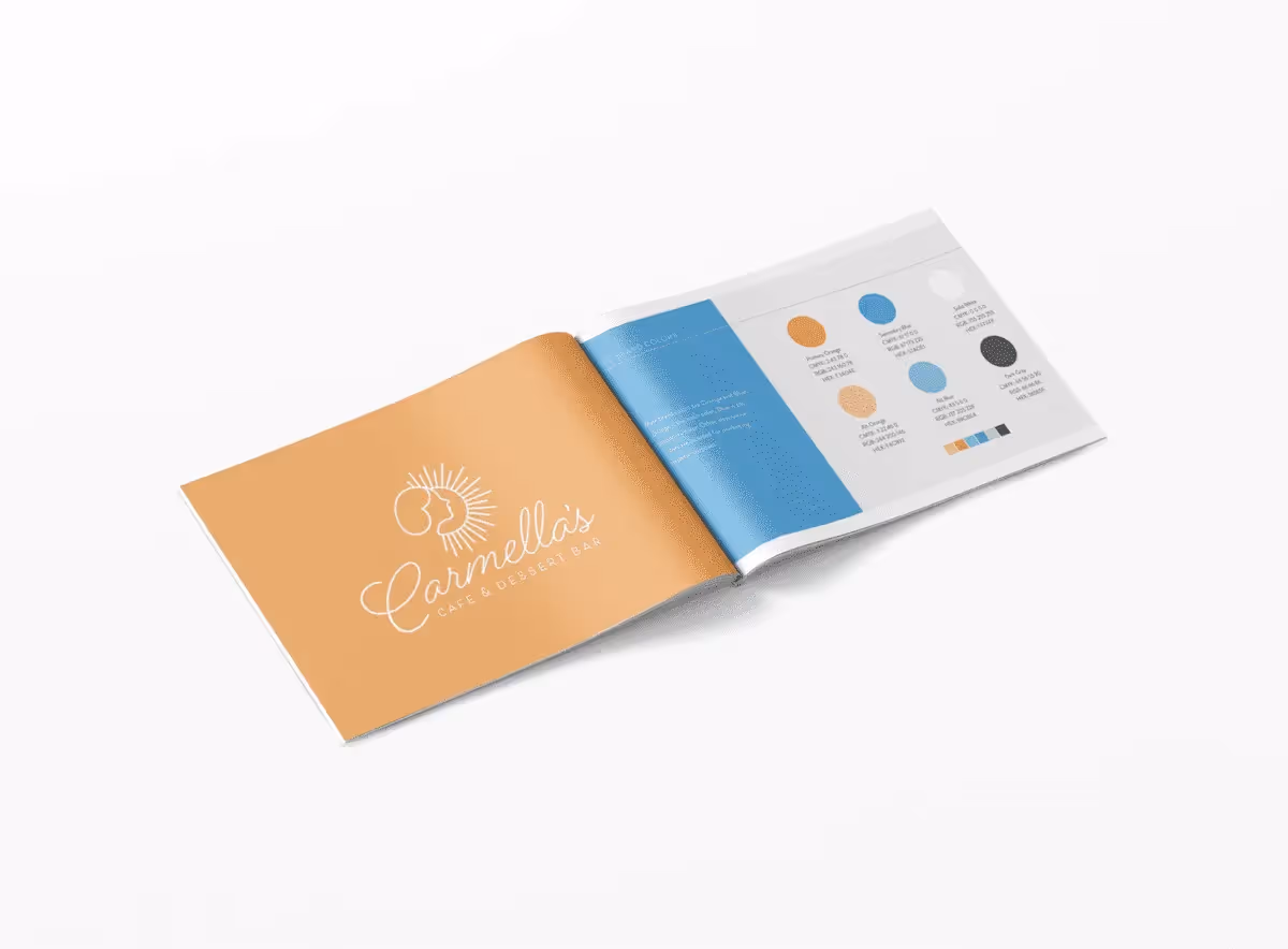
3. Color Palette
Your brand colors are some of the most recognizable aspects of your overall branding. There isn’t a set number for how many colors you should incorporate in your branding. Ultimately, it will vary depending on other aspects of your business and brand identity. For example, if your overall brand aesthetic is modern and minimal, you may want to stick to minimal use of color; but if your brand is bright and cheerful, you could enhance your overall aesthetic by using multiple complementary brand colors. A tool that can be helpful for developing your brand colors is Coolors.co, a color palette generator that helps to compile potential color schemes. You can browse a curated selection of color palettes compiled by other users, or browse new potential palettes based on certain established color codes you already know you’d like to include.Once you’ve chosen your brand colors, document your color codes in your brand style kit to ensure the exact colors are used across all mediums. Web design often works with Hex does (a pound sign followed by six alphanumerical characters; for example #000000 is black. RGB color codes are also commonly used for digital. For printed materials, you’ll want to include CMYK or Pantone color codes.
4. Fonts / Typography
Fonts are one of the most important, yet most overlooked, essential elements of a brand style guide. The font(s) you choose to represent your brand should be thoughtfully selected to reflect your brand identity and how you’d like to be perceived. Fonts are often described in terms of their general character—playful, modern, classic, feminine. In general, it’s best to stick to just two fonts. We often recommend one serif and one sans-serif font. Serif fonts are easier to read in large blocks of text, whereas sans-serif fonts (those without the little lines on the ends of its characters) tend to be more screen-friendly. Script fonts may be useful for stylistic accents. Like your brand colors, the appropriate font(s) for your particular business will vary depending on several factors such as industry, brand voice and tone, target demographic, and types of marketing materials you’ll be using.
5. Imagery
We cannot overstate the importance of professional imagery to market your brand. If you have the resources, we suggest a professional photoshoot for your brand. But if that’s not in your budget or you plan to incorporate stock or user-generated images, establish image guidelines for your brand to help maintain consistency across all platforms—website, email marketing, social media, print marketing materials. Be descriptive and provide examples of appropriate visuals, along with general do’s and don’ts for visual treatment. If you favor well-lit, realistic photography over illustrations, make that clear.
6. Brand Tone/Voice
Brand tone refers to the words that your company chooses to use in order to show your brand’s values and personality. Establishing the overall tone of voice used in your branding can be one of the more complicated parts of the branding process. To start, answer the following questions:
- Whose point of view are you speaking from? This might be the business as a whole, the founder or CEO, or maybe even a brand mascot.
- What style of communication does this voice have? Witty? Direct? Conversational?
- What type of vocabulary does this voice use? Formal? Industry jargon? Slang? Common keywords phrases? Multi-lingual?
- Who does this voice speak to? Does it speak directly to a single person or to a broad audience in general?
Using Your Brand Style Guide
Brand style guides are usually shared as downloadable PDFs or print documents and serve as a quick reference to understanding the logos, colors, fonts, and messaging that represent your brand. We recommend distributing your brand style guide to employees and key partners, such as your printing vendor, media partners, external stakeholders, or anyone that will play a role in your telling your brand’s story.
Get Started
If you need help establishing or refining your brand, the team at TargetMarket is ready to help. We will work with you to identify what visual design and message you should be using to convey the value of your company to potential customers. Then, we will create a unique brand identity and use it as a filter to ensure that your image is both cohesive and consistent across all print and digital media platforms. Click the get started button below to schedule a free consultation.