.svg)
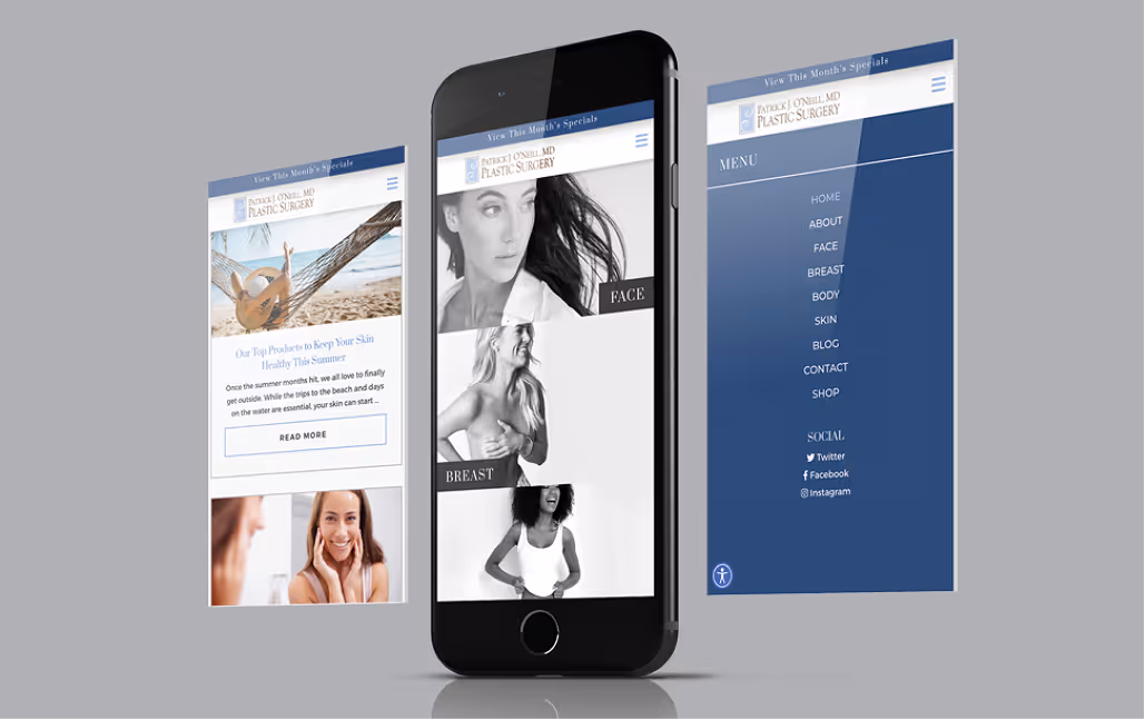
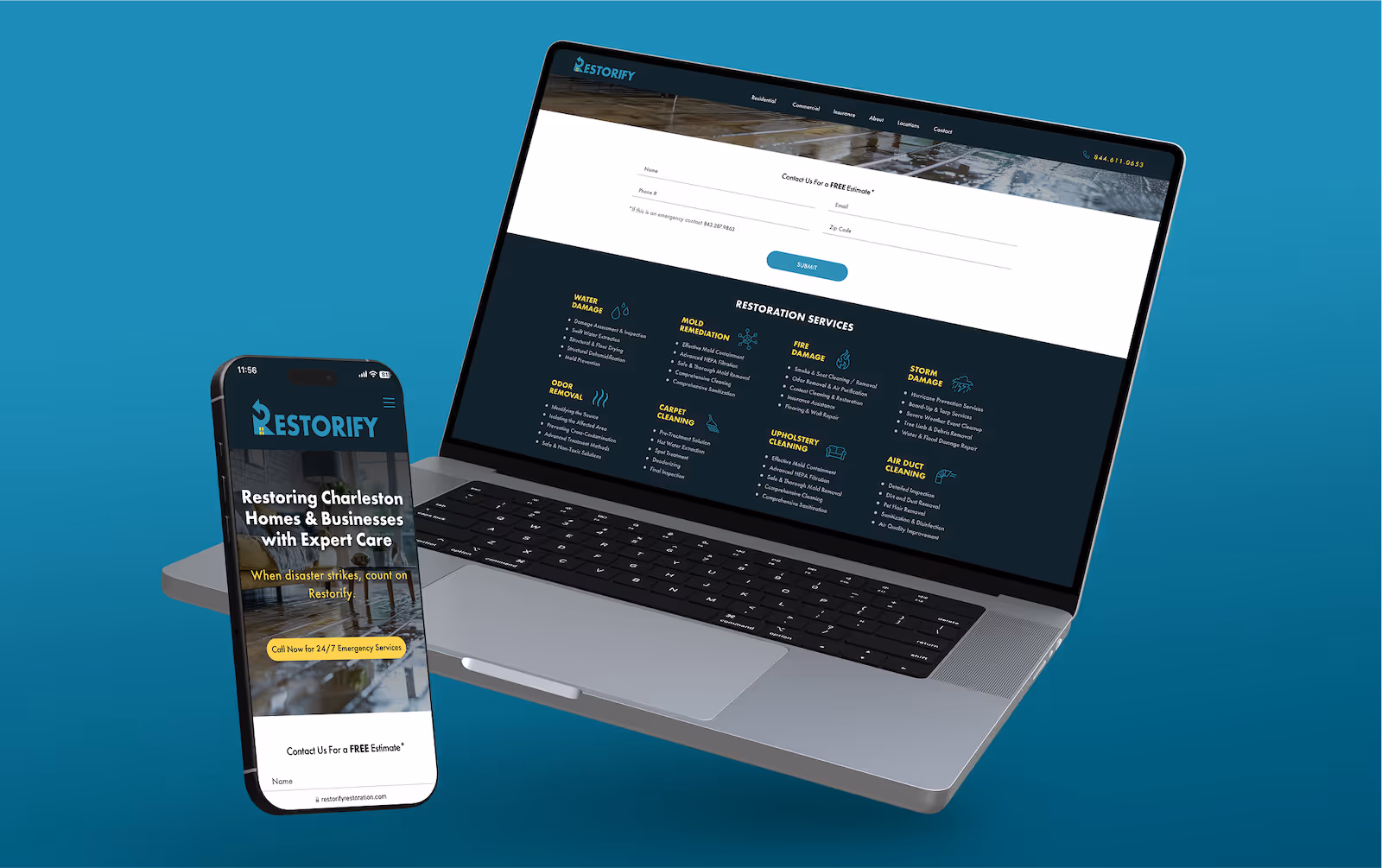
We design every site with mobile-first responsiveness, ensuring your content looks and functions beautifully on every screen size. Whether your users visit on desktop, tablet, or mobile, they’ll experience a seamless interface optimized for speed, usability, and engagement. Every element is thoughtfully built to translate seamlessly across all screen sizes.

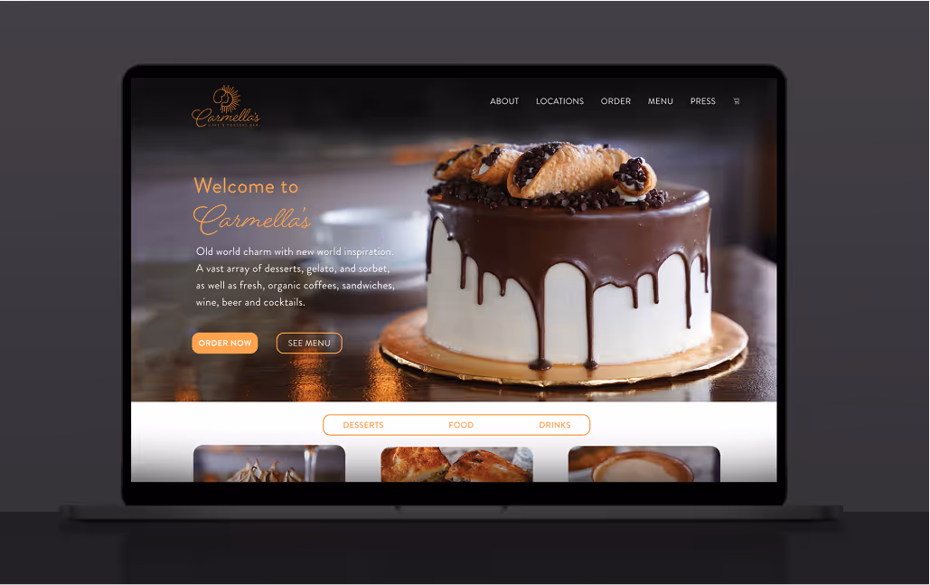
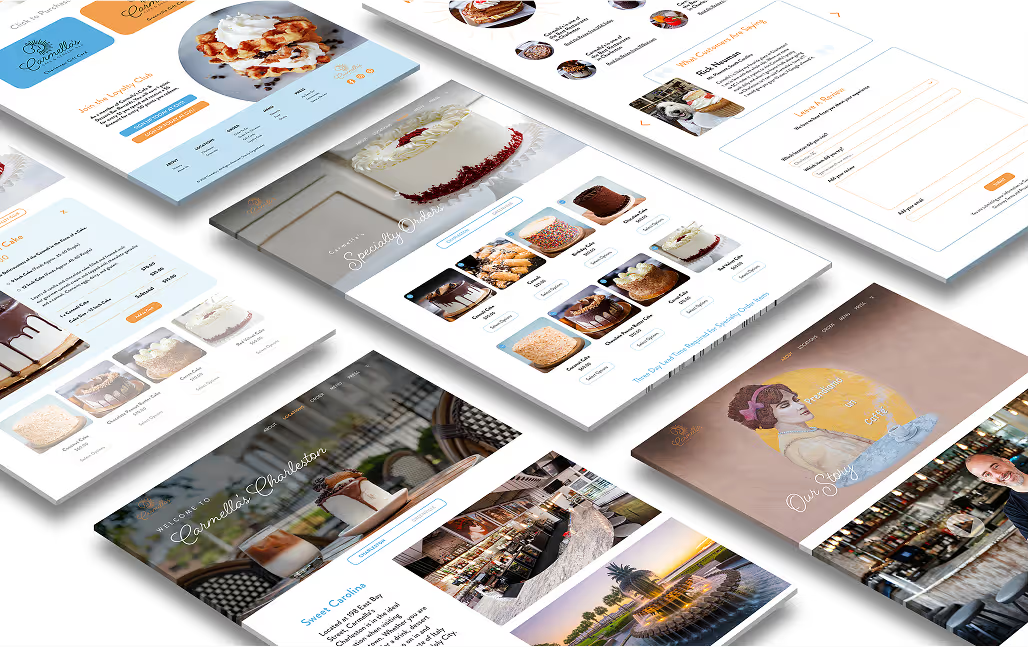


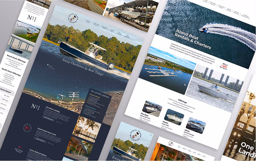

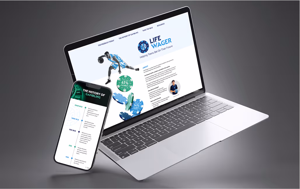

Your website should do more than look good. It should reflect your brand’s identity and values at every level. We take a strategic approach to design, creating visual systems, layouts, and interactions that feel unmistakably yours. Every element, from colors and typography to iconography and motion, is tailored to support your story, goals, and target audience.
Design and development mean nothing without visibility. We create websites that are optimized for discoverability from the ground up. From keyword-aligned copy and semantic structure to meta tags, alt text, and URL hierarchies, your content will be built to rank, without sacrificing voice or clarity. We lay the technical and strategic foundation for long-term SEO success, so your site performs in search from day one.
Our process focuses on performance, maintainability, and scalability. We use clean, semantic HTML, CSS, and JavaScript combined with modern tools like Webflow or custom frameworks to deliver high-performance, ultra-responsive websites. Webflow’s powerful responsive design capabilities allow us to fine-tune layouts for every breakpoint, ensuring an exceptional user experience on any device.
We don’t just build websites, we craft experiences rooted in strategy and insightfulness. Every interaction is designed with clarity and purpose to guide users smoothly toward your goals, whether filling out a form, exploring your services, or making a purchase. With streamlined navigation, clear calls to action, and thoughtful layout decisions, we create intuitive interfaces. It’s how we turn casual clicks into meaningful interactions and meaningful interactions into measurable growth.
